“An international volunteer organization supporting underprivileged children and families through education.”
Introduction:
RWB Charity is a nonprofit organization committed to supporting underprivileged children in Iran who lack access to basic education and learning resources. The organization works to bridge the educational gap by providing school supplies, digital tools, and financial assistance to students in remote or underserved regions, empowering them with opportunities to learn, grow, and build brighter futures.
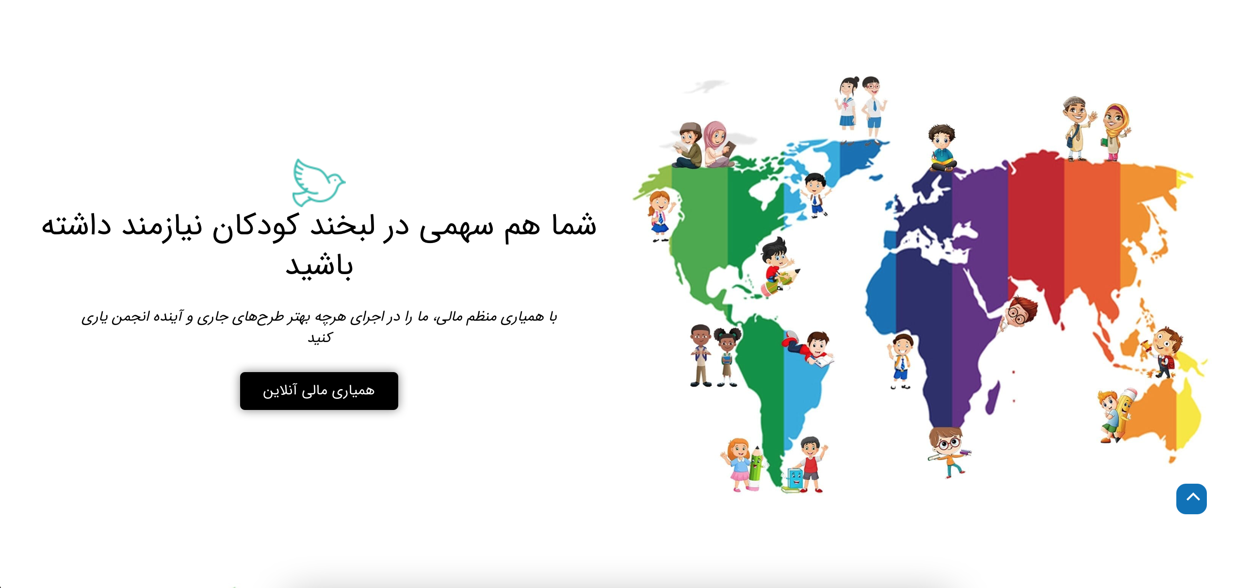
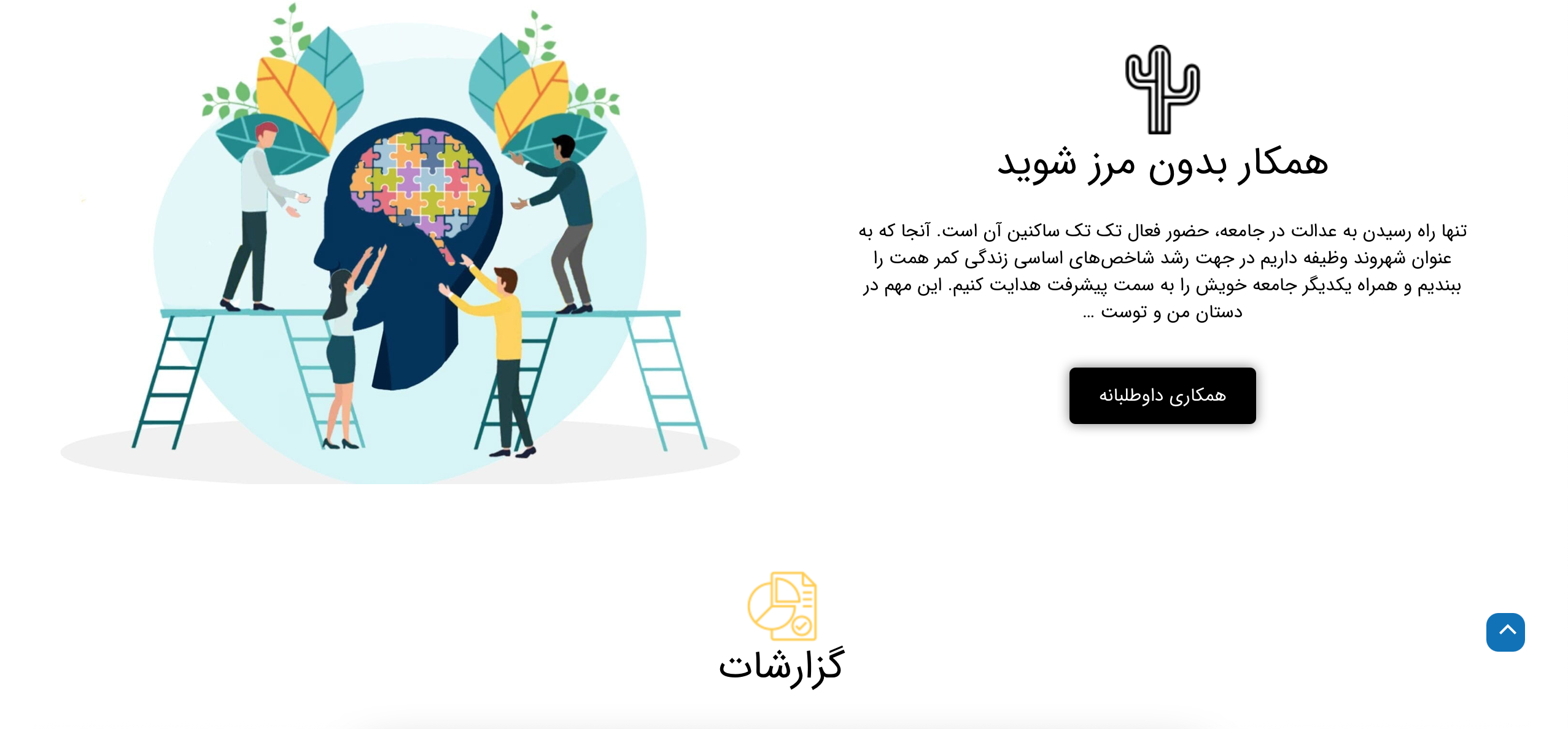
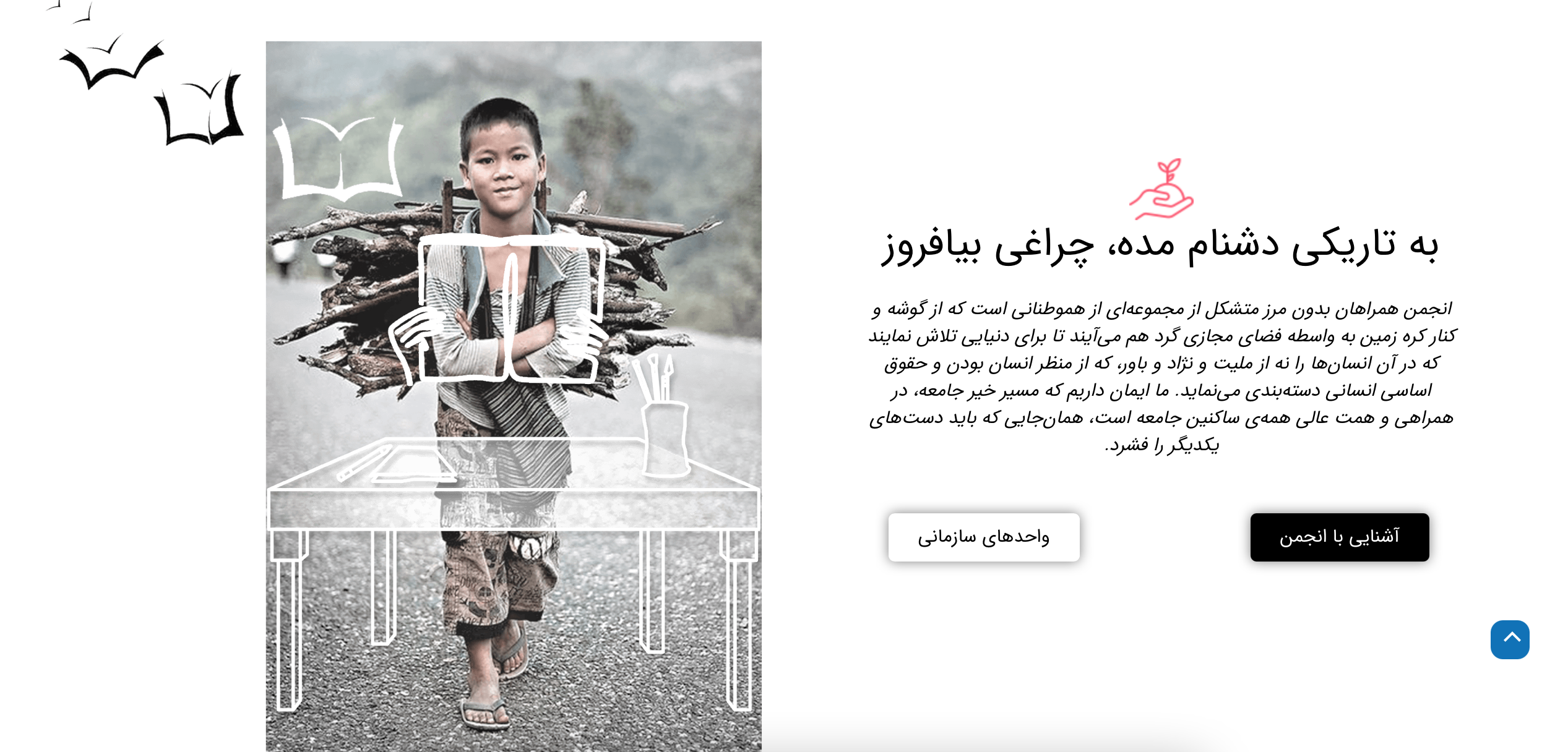
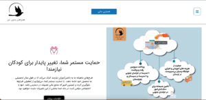
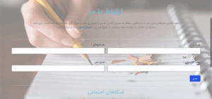
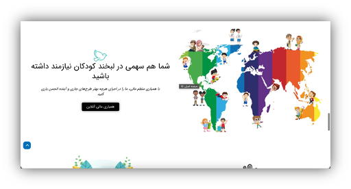
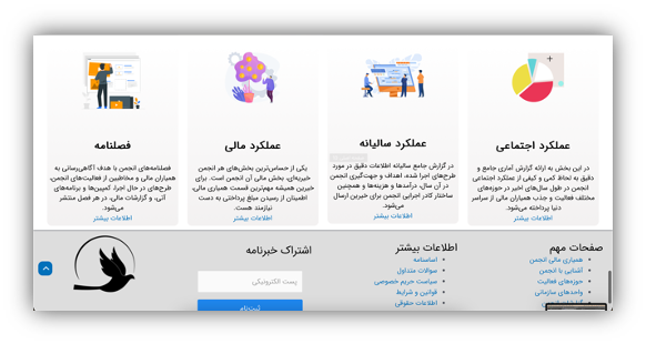
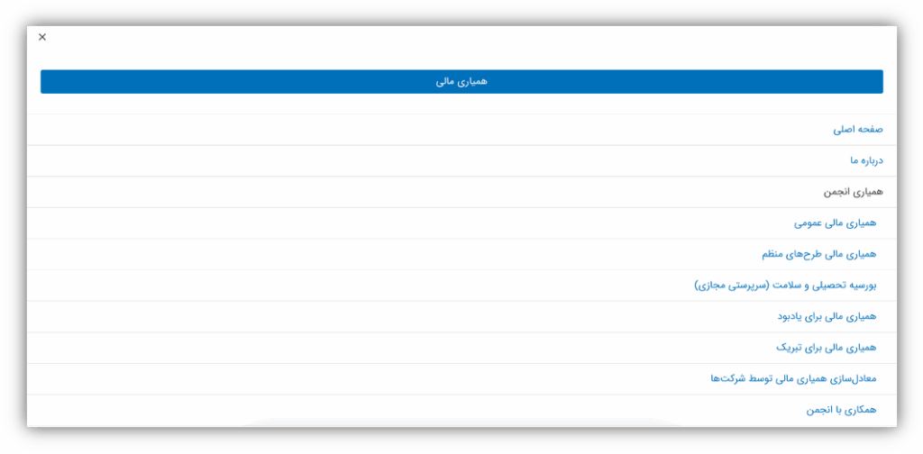
Screenshots of Initial RWB Homepage
My Role & Responsibilities
In this project, I led the UX/UI design process for the RWB Charity website redesign and also contributed as part of the front-end development team. My responsibilities covered the full design cycle—from research and strategy to wireframing, interface design, and developer handoff.
My key contributions included:
Conducting stakeholder interviews, usability testing, and surveys to inform design decisions
Creating user personas, journey maps, and restructured information architecture
Designing low- and high-fidelity wireframes in Figma, with a focus on accessibility and clarity
Defining the visual language: color palette, typography, spacing, and component design
Developing responsive UI elements and collaborating closely with developers to ensure design accuracy during implementation
Aligning web design with RWB’s branding and social media identity
Why We Redefined the RWB Charity Experience
RWB is an international volunteer organization committed to supporting underprivileged children and families through education. Their mission is noble — but their digital platform wasn’t doing it justice.
So we asked ourselves: How can we redesign this experience to truly reflect the charity’s impact?
💡 Improve donation flow and increase engagement
📱 Enhance usability for diverse audiences
🎯 Address core pain points in navigation, accessibility, and storytelling
Our Key Research Questions
- What challenges do users face when donating or navigating?
- Who are our primary target users?
- How do competitors streamline the donor journey?
- What technical constraints could impact redesign?
When we first examined RWB’s website, we saw a disconnect between its heartwarming mission and its online experience. Critical moments — like making a donation or reading a child’s story — felt unintuitive, emotionally flat, or hard to navigate, especially for Iranian donors.
Listening First: What Stakeholders Told Us
We held early design discussions with 2–3 key stakeholders, with Soroush acting as our main point of contact. These sessions helped us align expectations and uncover crucial pain points and aspirations.
 Growth Ambition: RWB wants to grow from 100 to 200+ active donors in one year.
 Navigation Struggles: Users found it difficult to locate campaigns, gifts, and make multiple donations in a single session — disrupting the donation flow.
 Technical Limitations: The site faced front-end constraints, with a clear need for a new developer to improve interaction and layout.
 Missing Storytelling: Stakeholders noted the absence of children’s stories, weakening emotional connection. They wanted stronger narrative elements to engage donors on a human level.
From Listening to Action: Our UX Strategy
With a clearer picture of RWB’s challenges and ambitions, we moved from discovery to design. Every insight became a building block in our strategy — not just to improve usability, but to build a deeper emotional connection with future donors.
What Guided Our Design Strategy
We focused on four key pillars:
Simplify the Structure
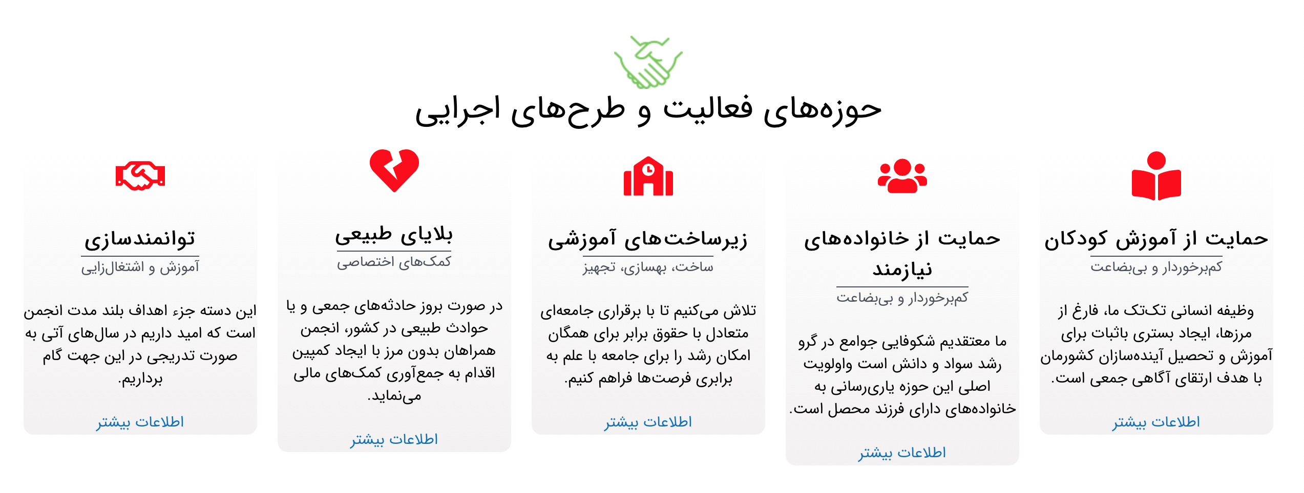
We redesigned the information architecture from scratch — replacing the cluttered vertical structure with a streamlined horizontal layout and clear subcategories.Make Giving Effortless
Inspired by competitor best practices, we reimagined the donation flow: enabling multiple donations in one session and reducing friction.Center the Story
We prioritized narrative — carving space for real stories and images of the children RWB supports, creating an emotional anchor on the homepage.Design for Everyone
We introduced bilingual support and laid the groundwork for a fully responsive, mobile-first experience.
What Came Next
This strategy led to the following steps in our design process:
Competitor Analysis
We benchmarked 3 successful charity websites to identify proven UX patterns for storytelling, donation flow, and accessibility.- Internal Team Survey
To ground our work in organizational realities, we surveyed 15 active RWB members. Their feedback highlighted CMS pain points, mobile responsiveness issues, and a need for stronger storytelling tools — reinforcing the urgency of a redesign. Usability Testing of the Original Site
Testing revealed where users got stuck and validated stakeholder concerns about navigation and trust-building.User Personas & Journey Mapping
We created two core personas and mapped their emotional paths — helping us define the moments that matter most.- From Friction to Flow: Restructuring the Website.
Low & High-Fidelity Design Iterations
With the strategy and user insights in place, we brought our ideas to life — first in sketches, then in refined high-fidelity homepage designs.
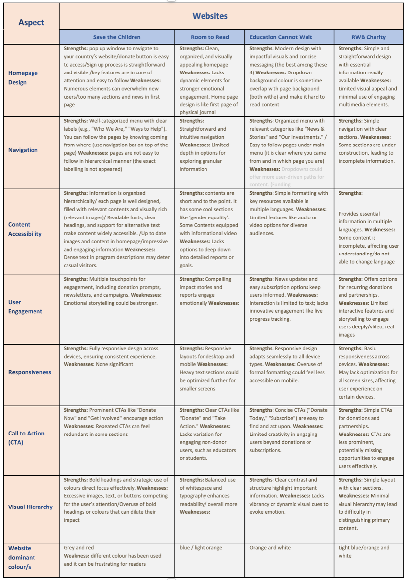
1. What Others Got Right – Competitor Analysis
To inspire and ground our redesign, we explored how other nonprofits structure their donation journeys. We chose three well-known charities with active donor bases and strong digital presence and compare them with RWB Charity. Our goal was to uncover what works, what doesn’t — and what RWB could adopt or improve on.
Key Questions We Asked:
How intuitive is their navigation?
How do they guide users to donate?
Do they use emotional storytelling effectively?
Is the site accessible and mobile-friendly
Key Takeaway:
Simple structure works best: All three charities used clean layouts, whitespace, and focused storytelling to engage users quickly.
CTAs must be obvious: Clear, varied, and emotionally framed calls to action outperformed generic ones.
Responsive design matters: Every strong site was optimized for mobile — RWB needed significant improvement here.
Emotional storytelling = impact: Engaging visuals, human stories, and dynamic content increased donor trust and motivation — something RWB lacked but could build.
These insights confirmed that RWB didn’t just need a visual redesign — it needed a shift in narrative clarity, technical responsiveness, and donor-centered storytelling. That understanding shaped our next steps: defining our users and mapping their emotional journey.
2. Internal Team Survey
To understand the website’s challenges from an operational perspective, we surveyed 15 active RWB team members. Their feedback revealed key issues: a confusing content management system, mobile layout problems, and a lack of storytelling tools to convey the charity’s impact. These insights helped us align the redesign with both user and team needs.
Questionnaire sample: https://RWB Charity
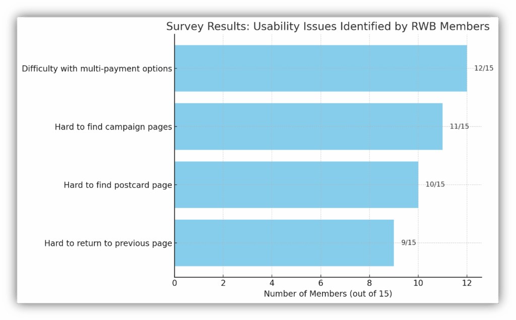
- 80% of respondents had trouble accessing multi-payment options.
- 73% found it difficult to locate campaign pages.
- 67% reported issues finding the postcard (card postal) page.
- 60% struggled to return to the previous page during navigation.
3. Usability Testing + Insights of original website
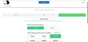
To evaluate the real-world experience of RWB’s website, we conducted usability testing with four users: two based outside Iran and two inside Iran, representing both first-time and returning donors.
Our goal was to observe whether users could successfully navigate the donation process, especially across different currencies (euros and Iranian rials), and identify blockers in making single or recurring donations.
Key Tasks Participants Were Asked to Complete:
Donate €25 to a specific Eidane campaign (without completing the transaction).
Donate 5 million rials to a specific campaign.
Check if recurring monthly donations were possible.
Send a postcard from the RWB site instead of donating.
After each task, we asked:
“What is your first impression of the website?”
“What do you think RWB does?”
“How easy or difficult was it to complete the task?” (1 = Very Difficult, 5 = Very Easy)
What We Observed:
Through task-based usability testing with four real users , two from inside Iran and two from outside we observed how first-time and regular donors navigate the RWB website. Our goal was to assess whether users could easily donate in different currencies, set up recurring donations, and engage with non-donation features like sending charity postcards.
The testing revealed navigation struggles, unclear pathways to key features, and inconsistent language support. To better capture these findings, we synthesized user behavior into a representative persona and user journey map — helping us translate raw feedback into actionable UX direction.
Snapshots of the initial RWB Charity website pages
4. User Personas & Journey Mapping
This journey reflects the emotional and functional friction Bita and Sara experienced while navigating donation tasks — including moments of confusion, success, and inspiration.”
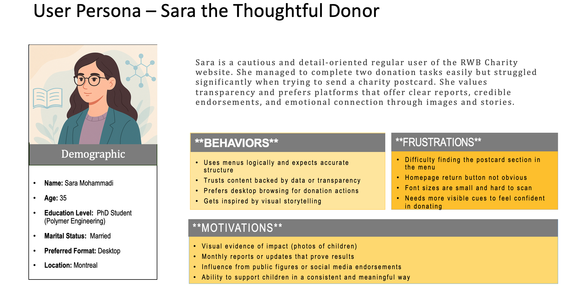
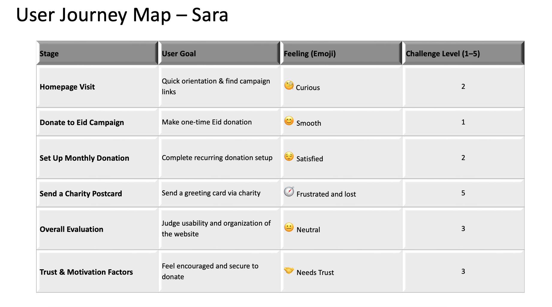
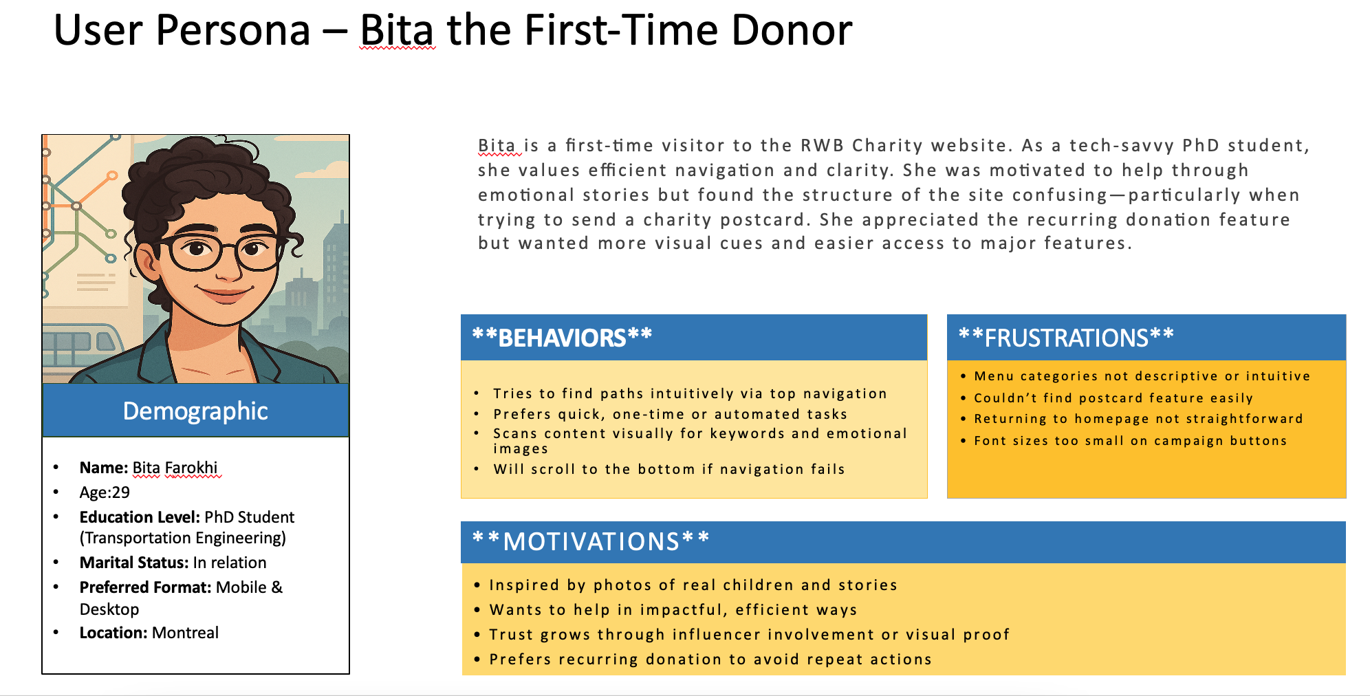
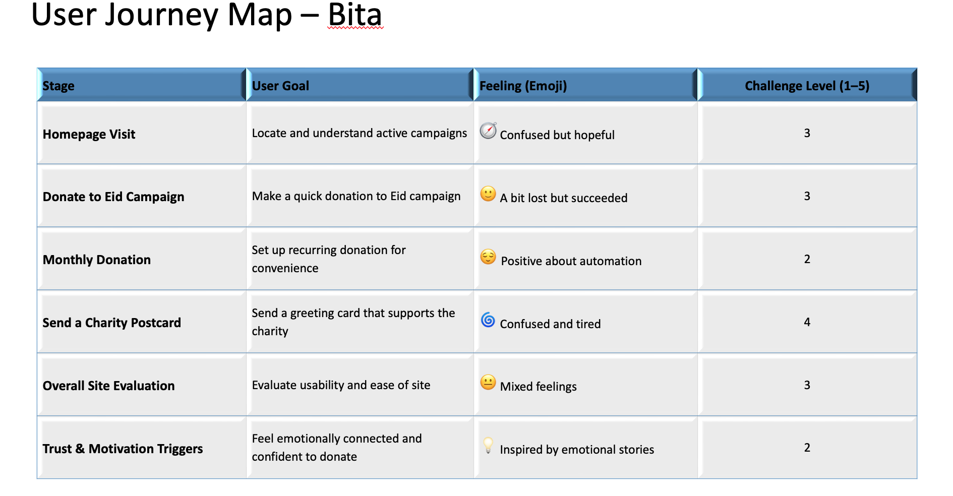
These artifacts helped us prioritize features like clearer navigation labels, stronger visual cues for donations, mobile responsiveness, and improved storytelling throughout the site.
5. From Friction to Flow: Restructuring the Website
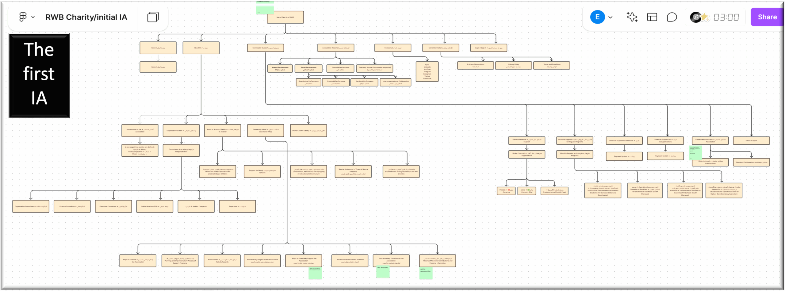
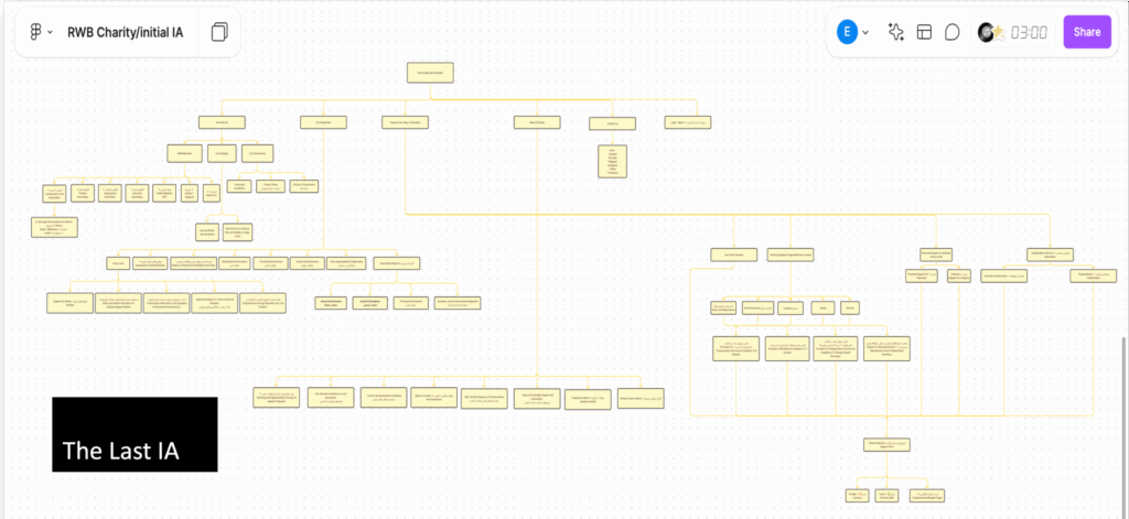
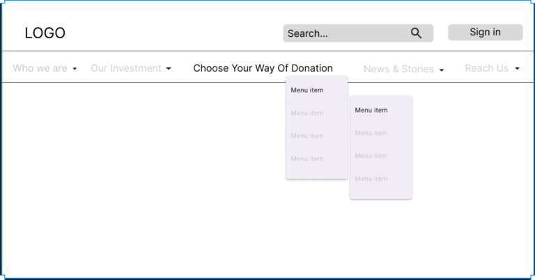
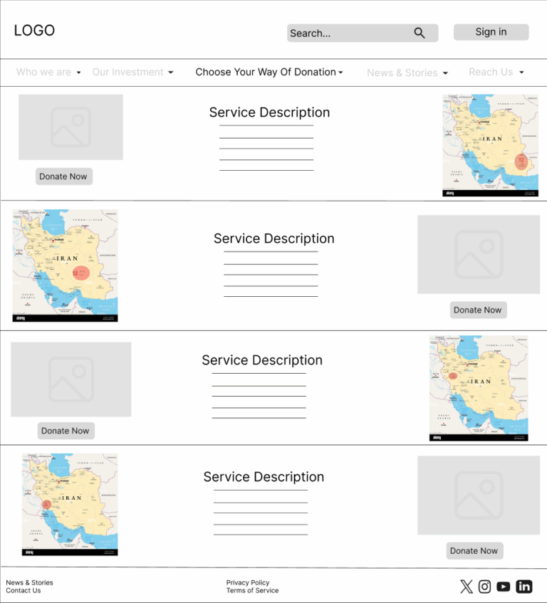
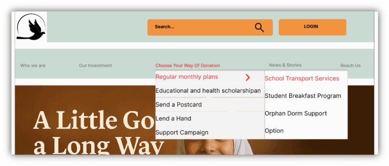
Redesigning the Structure – New Information Architecture
After identifying pain points through stakeholder interviews, internal surveys, and usability testing, we realized that the existing website structure was contributing significantly to user confusion. Navigation was inconsistent, menus lacked clarity, and critical features like donation options and campaign stories were buried under vague or miscategorized links.
To address this, I used FigmaFig to redesign the site’s information architecture with a clear focus on:
Simplifying the top-level navigation
Organizing subcategories under intuitive headings
Ensuring scalability for future services
Prioritizing search functionality
🔁 Old vs. New Structure
Using FigmaFig, I visualized both the old and proposed architecture to compare depth, hierarchy, and labeling. The new structure reduced cognitive load and aligned better with user behaviors observed during testing.
| Old IA Issues | New IA Improvements |
|---|---|
| Vague categories like “Activities” | Clear categories like “Campaigns” |
| Donation buried under 2–3 clicks | Donation now a top-level menu item |
| No search bar | Added search with keyword support |
| Inconsistent menu depth | Streamlined to 2-level navigation max |
| Vertical sidebar menu | Switched to horizontal top navigation for clarity |
| Dispersed donation entry points | Grouped under a dedicated “Ways to Help” section |
| Minimal visual hierarchy | Organized dropdowns with logical groupings |
This architecture transformation served as the foundation for all wireframe and high-fidelity design decisions that followed.
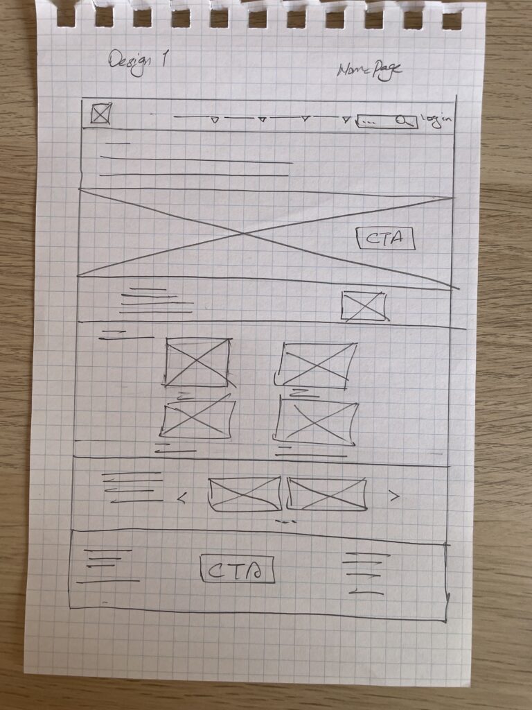
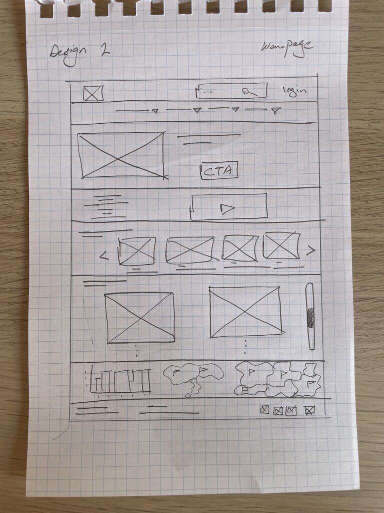
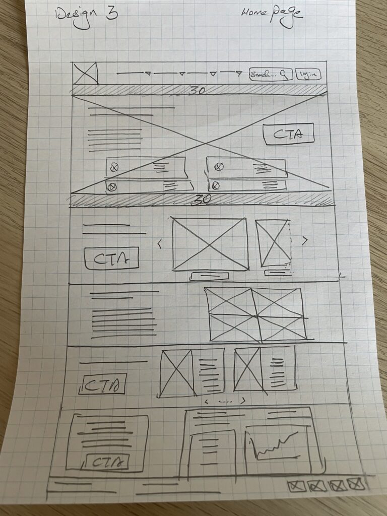
From Sketches to Screens – Low & High-Fidelity Design Iterations
With a clear information architecture in place, we transitioned into visual exploration. Our goal was to transform user pain points and emotional drivers into an intuitive, engaging design experience.
✏️ Low-Fidelity Wireframes
We began with low-fidelity wireframes to quickly explore layout ideas, content hierarchy, and visual flow. These early sketches allowed us to:
Prioritize key user actions like donating, exploring campaigns, or sending a postcard
Test placement of new features such as the search bar and donation paths
Establish a clean, scannable grid system suitable for bilingual content and mobile devices
These wireframes helped validate our assumptions before investing time in detailed visuals.
Sketches and Low-Fidelity Design
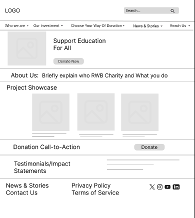
🎨 High-Fidelity Prototypes
Once confident in the wireframe structure, we developed high-fidelity mockups that brought the design to life. Key updates included:
A warmer, more human-centered color palette
Clear donation CTAs and hierarchy
Emotionally engaging photography and real stories
Streamlined navigation and mobile responsiveness
These high-fidelity designs reflected everything we’d learned through research, testing, and stakeholder collaboration — creating a visual identity that aligns with RWB’s mission and values.
The designs you’ll see below are the result of iterative feedback and continuous alignment with user needs and project goals.
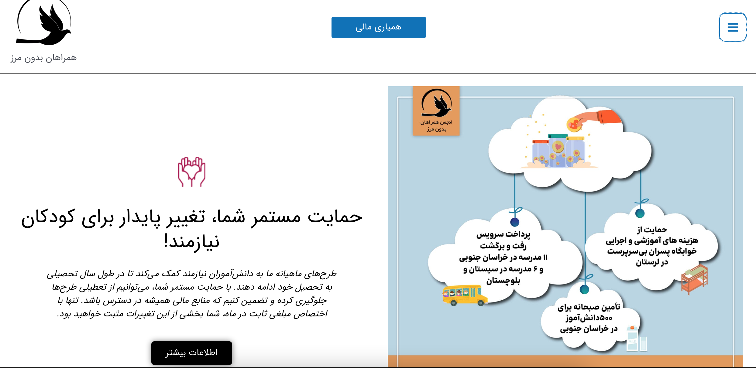
Initial homepage design of RWB
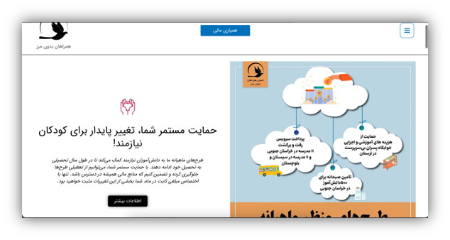
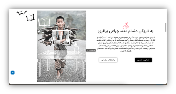
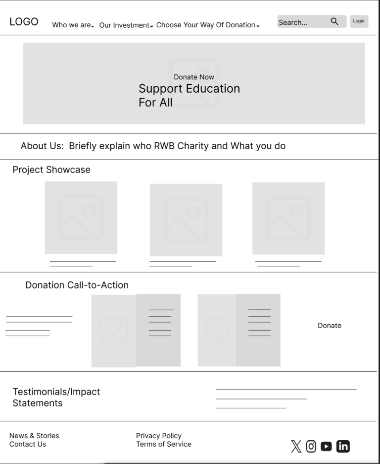
Current Homepage design of RWB
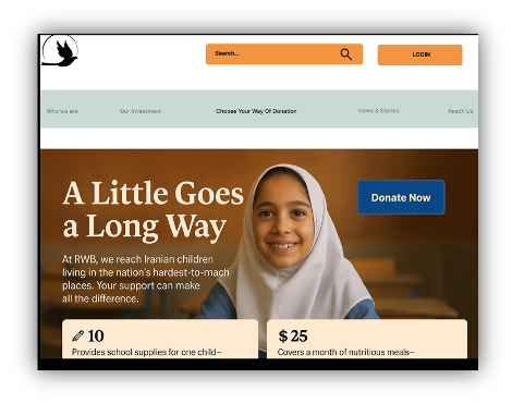
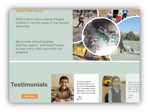
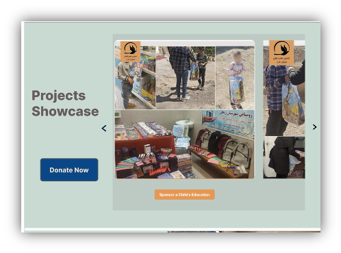
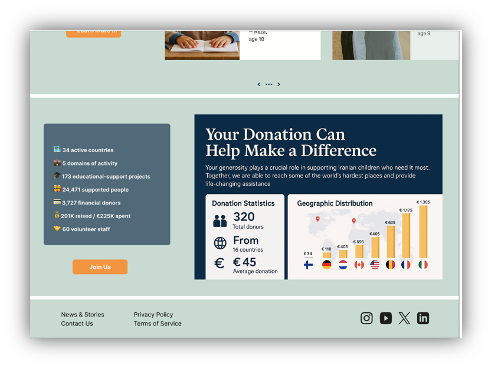
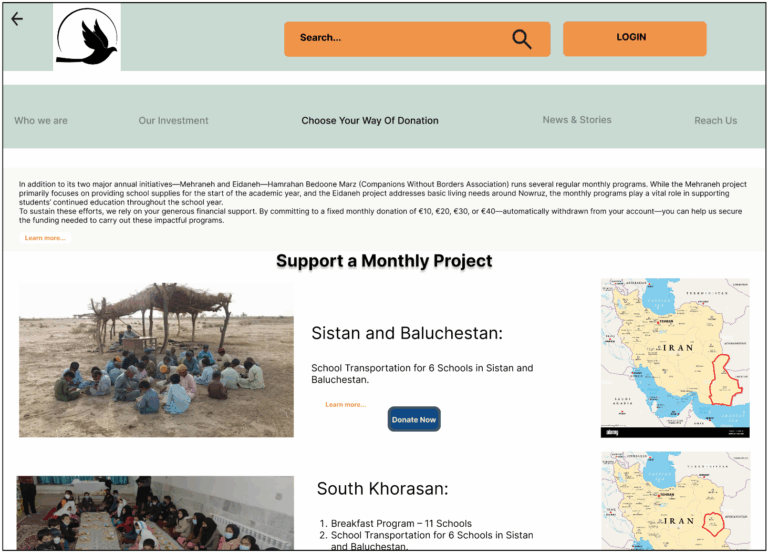
Homepage UI Redesign – Before & After
To fully transform the user experience, I redesigned the RWB Charity homepage by rethinking not just its structure, but also the emotional and visual tone it conveys. The new design was rooted in the goal of building a clearer, more inspiring, and action-oriented experience that better reflects the organization’s mission.
The old homepage, shown above with a white background, suffered from uneven spacing, inconsistent layout structure, and a lack of visual rhythm. Sections were crowded together without breathing room, CTAs were not prominent, and the neutral color scheme failed to capture the warmth and hope at the heart of RWB’s mission. While the content was informative, it lacked clarity, emotional depth, and cohesion.
In contrast, the new homepage design introduces a light green background, a deliberate choice to create visual harmony with the organization’s social media content. This subtle shift in tone instantly makes the experience feel more compassionate and trustworthy. I applied 30px white spacing between sections, allowing each content block to stand on its own while contributing to an overall visual flow.
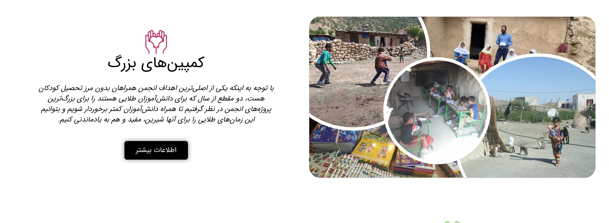
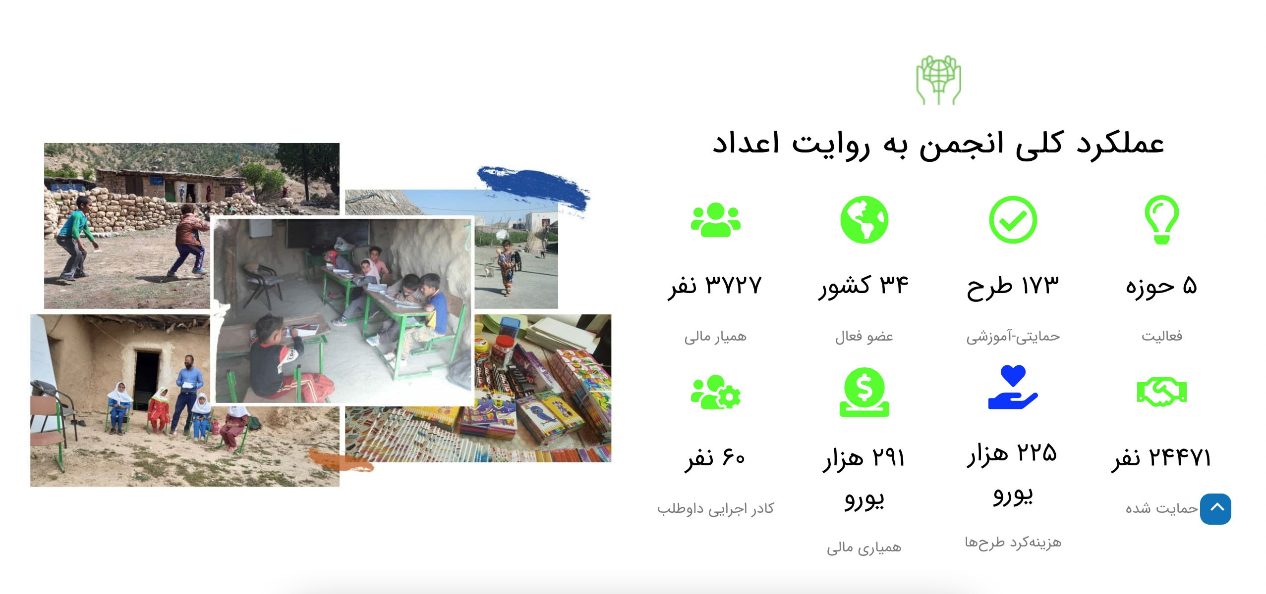
The call-to-action buttons were completely redesigned to be more inviting and attention-grabbing. With vibrant color fills, generous padding, and defined hover states, these CTAs now stand out as key decision points for users. Visual storytelling was also elevated by incorporating larger images, real testimonials, and intuitive iconography that guide the user through the site naturally.
Typography and layout were refined to create a stronger hierarchy, ensuring that headlines lead users to important information without overwhelming them. The content is now grouped logically, and the visual journey flows smoothly from introduction to engagement, from emotional resonance to practical action.
This redesign transforms the homepage into an experience that is not only easier to navigate but also emotionally aligned with the charity’s purpose. It encourages users to take meaningful action and trust that their contributions make a difference.
UI Style Guide – RWB Charity Website
| Step | UI Element | Details |
|---|---|---|
| 1 | Color Palette | – Primary: Light Green #C7DAD1 – CTA Button: Bold Blue #0A2844 – Accent: Soft Orange #F29440 – Text: Dark Gray #000000 – Background: Neutral White #FFFFFF |
| 2 | Typography | – Headings: Poppins/Inter (H1: 36px Bold, H2: 28px Medium) – Body Text: Poppins/Inter, 32px Regular – CTA Buttons: Inter, 32px Bold |
| 3 | Buttons & Interactions | – Primary CTA: Blue (#0B4787), 16px/32px padding, 8px radius → Hover: Slight scale + color darkens slightly – Secondary: Border in #F29440, transparent fill, hover fills red with FFEBD0 |
| 4 | Spacing & Layout | – 30px vertical white space between homepage sections – 12 column responsive layout grid |
Project Wrap-Up & What Comes Next
Redesigning the RWB Charity website was more than a visual update — it was a transformation grounded in research, empathy, and clarity. From stakeholder interviews and internal surveys to usability testing and design iteration, every step aimed to realign the platform with the organization’s mission: making education and aid more accessible for underserved children in Iran.
Through restructured navigation, simplified donation flows, bilingual support, and emotionally resonant visuals, we delivered a website experience that is not only easier to use but more aligned with the values and goals of the RWB team and their supporters.
Next Steps
Usability Testing (V2): Validate the new designs through moderated testing with first-time and repeat donors.
Developer Handoff: Collaborate with developers to implement responsive, accessible code that mirrors the Figma designs.
Content Strategy: Work with the RWB team to expand and update story-driven content.
Post-Launch Monitoring: Track engagement metrics to assess how the redesign impacts donor growth (target: from 100 to 200+ donors).
This project was a powerful reminder that thoughtful design can make impact tangible, emotional, and accessible. I’m excited to continue supporting digital tools that create meaningful change.